Visual Design and CMS Build

Lowe’s Home Improvement

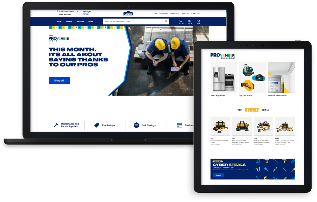
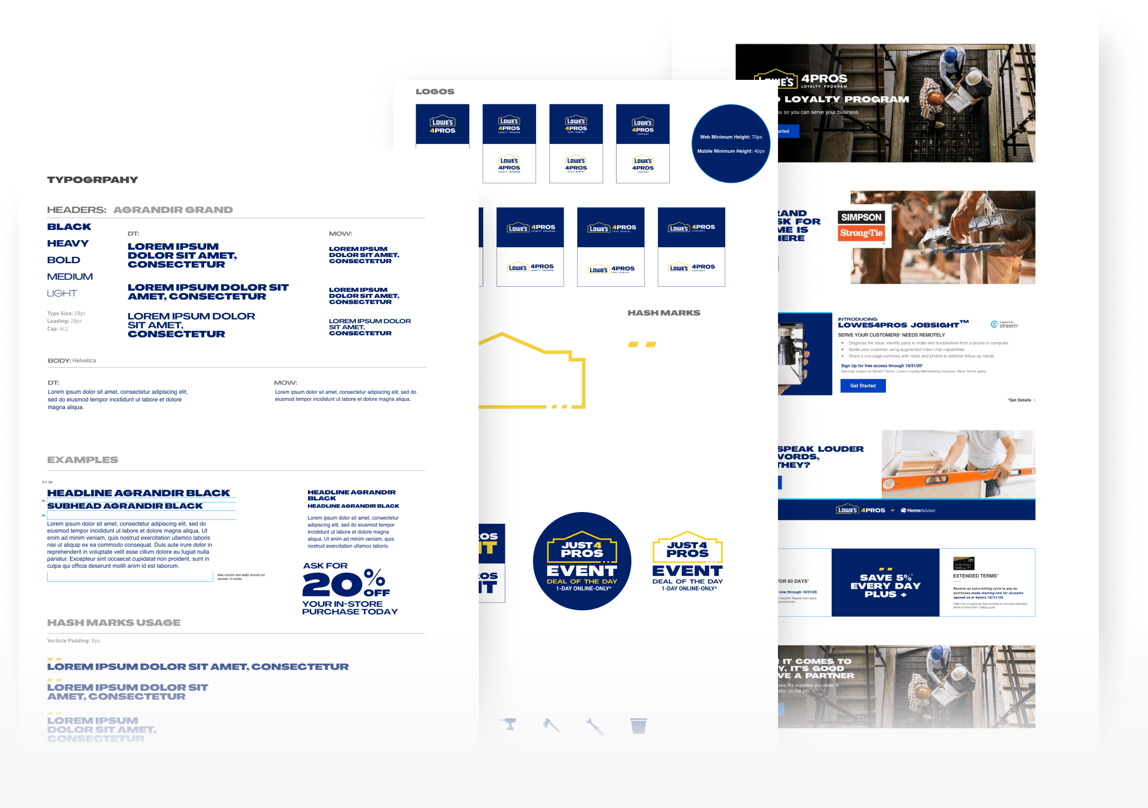
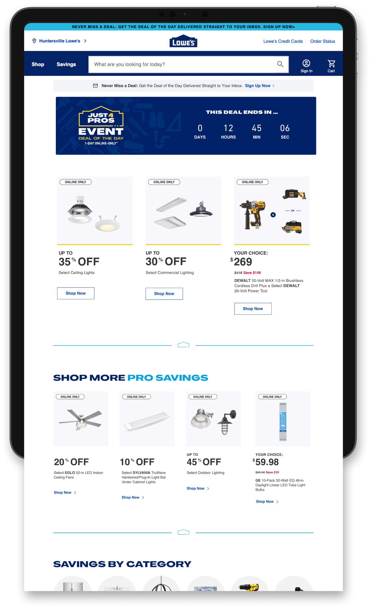
Designing for omnichannel at scale in a fast pace environment

While at Lowe’s I was able to touch a ton of fun projects although most of my time at Lowe’s was spent during the pandemic. Being on the Ecomm team meant we were in high demand with quick turnarounds. We had to be fast but thoughtful in our designs to support scalability and constant change.

Cascading web design mockups on an Iphone, iPad, iMac, and Macbook.
Role
  • Visual Designer
  • Web Page Builder
Tools & Methods
  • Stakeholder Interviews
  • Competitive Research
  • Sketch
  • Invision
Deliverables
  • Wireframing
  • Hi-Fi Design Mockups
  • Icon Library
  • Web Page Templates

Lowe’s Home Services Redesign

Providing an Intuitive Process & Transparent Information

Lowe’s offers a large variety of home service types. This redesign initiative was funded by harsh user testing results of its previous design. This portion of the business was suffering from a lack of conversions due to confusing layouts, poor information architecture lack of clarity in processes, and poorly designed service request forms. The UX team had put together some low-fi layouts and highlighted several pain points for us to tackle with help from the counterparts in the copywriting and editing team to finalize and template our language and legal contingencies. 

Home Services Hub Page

Information Architecture, Category Refinement,
and Value Propositions.

The hub page is the main page for services. It’s where most users will start, and then funnel to a more specific type of install service. Then you have the 4 most common installation types to help quickly get users where they want and then we become more granular down the page, section by section. Towards the bottom, we have more detailed value propositions, where you can get more information on contingencies and the can-do’s and cannot’s.

Mobile Screens

Information Architecture, Category Refinement, and Value Propositions.

The hub page is the main page for services. It’s where most users will start, and then funnel to a more specific type of install service. Then you have the 4 most common installation types to help quickly get users where they want and then we become more granular down the page, section by section. Towards the bottom, we have more detailed value propositions, where you can get more information on contingencies and the can-do’s and cannot’s.

Scalable Page Templates

Lowe’s Installation Processes

Circling back to the usability test results, we found that most customers felt the installation process wasn’t clear and a lot of the steps were lost in cluttered pages and unclear hierarchy. This being vital for conversion, and informing the customer, we decided to give each step its own full-width row and stacked the steps to clear up any confusion that existed from the information architecture.

Icon library

User testing also shared insights as to why they favored The Home Depot. The insights told users liked seeing icons because they felt friendly and inviting. This led to us releasing an icon library for Lowe’s Home Services.

Lowe’s 4 Pros

Homepage, Style Guide, Events & More


I played a crucial role in working on high-visibility pages at Lowe’s, including the design and development of Lowe’s 4 Pros Homepage. I adhered to Lowe’s visual guidelines and style guide, while also supporting a re-brand rollout and introducing new design elements. Additionally, I contributed to the migration of the Lowe’s 4 Pros domain and customers, transforming the style guide into a resource library and incorporating approved marketing designs. It was an enriching experience that allowed me to contribute to the success of Lowe’s.

Homepage Design
& Scalable Templates

Scalable UI Grids and Treatment


This is a highlight shot of all the work I’ve done with Lowe’s 4 Pros Homepage. We organize our pages by fiscal week and design variants that populate in promo spots relative to the customer profile. I was put on L4P Homepage design for over a dozen fiscal weeks and several events/initiatives that needed custom graphics and original themes.

Brand Style Guide

Implementing a fresh re-brand rollout


Lowes 4 Pros marketing team had been working with an agency on rebranding and repositioning the domain and eventually looking to migrate it to Dotcom. Once the powers that be signed off on the new rebrand and style guide there were some gaps between the online experience and the new brand identity.

Being the most active designer on the team with Lowe’s 4 Pros materials, I decided to take the initiative and extract the essentials and lay out the materials in a file for us to leverage, helping defend our design decisions.

Pro Lockup & Landing Page Design


Because of my role with Lowe’s 4 Pros Hompage, and my former logo experience, my lead designer thought it would be a good idea to have me design a lockup for the L4P Deal of the Day Event that was taking place on Dotcom. Since this had multiple offers and products I had to put together consistent type scales and formats along with being generous with space to give each deal its ownership.